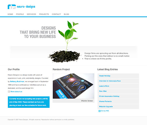
We’ve been hearing some suggestions from our current and past clients that our new website looked more like one of our client’s website instead of ours. We figured that probably it’s time that we do something about that largely menacing homepage graphic. Initially, when we redesigned our website, the homepage graphic served as a placeholder for us to rotate featured projects every week or so. But with our current project timeline and everything, we don’t think having that feature is anywhere feasible. A tag line, in the other hand, would make more sense, and at the same time giving a bit of human touch to the website.
Having a tag line is something that we’ve been wanting to do, but we never got a chance to sit down and brainstorm the whole thing. So there we have it, a new homepage graphic, and a random project preview right on our front page.
