Blog

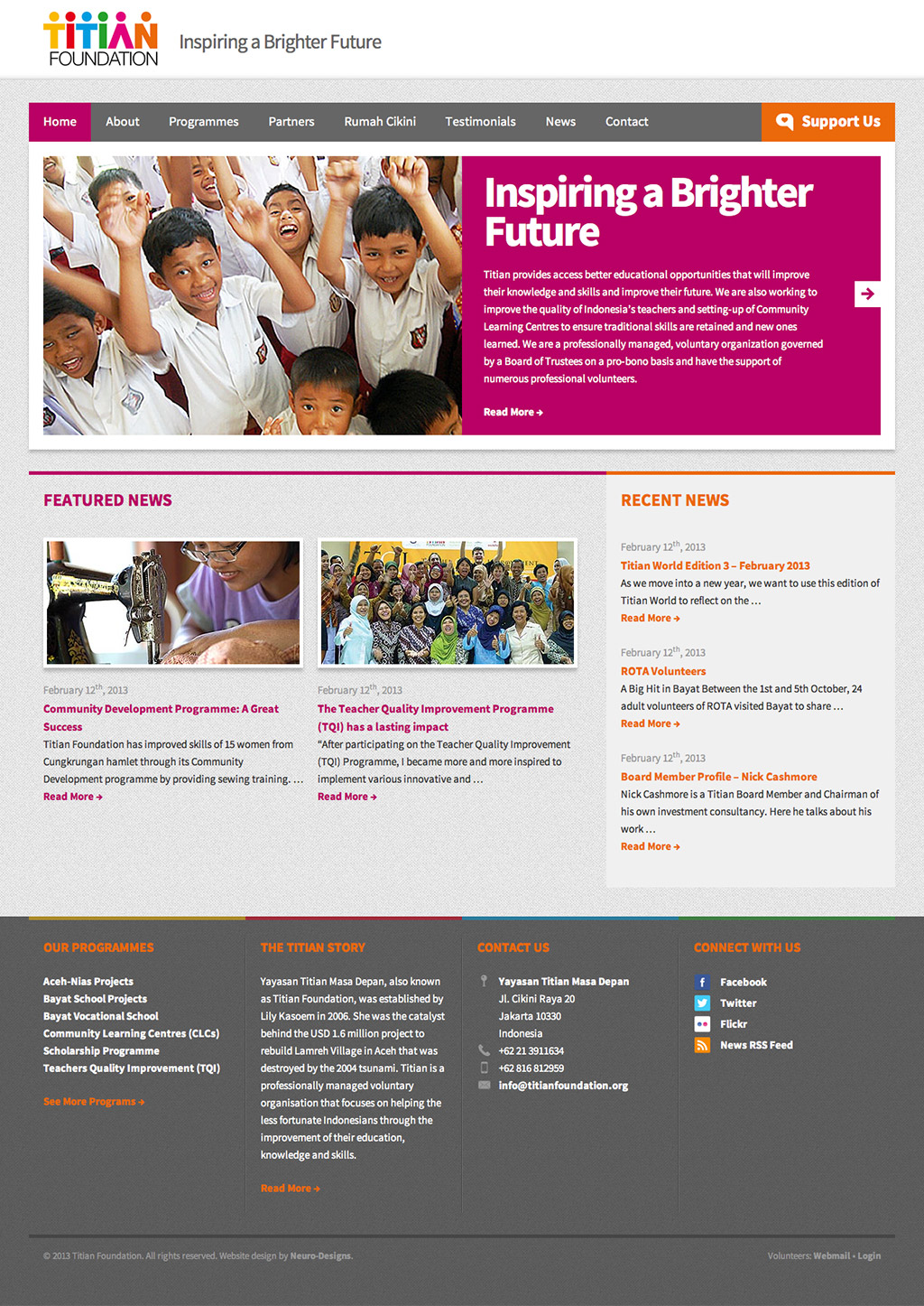
Titian Foundation Website

Recently, Neuro-Designs was commissioned to redesign Titian Foundation’s website. The main reason of this project is an approach departure, from a simple informational website, to something that is more engaging and attractive at the same time. As an experienced voluntary organization, Titian Foundation is instrumental to the people they help, and this new website design aims to help them attract people, be it donators or volunteers to assist the foundation in its cause for the less fortunate.

As there are so many things to be done and redesigned, this project has been one of the lengthiest we’ve ever done. Because we also did their previous website, outdoing ourselves has never been easy, and helping Titian Foundation fine-tuning their website to the very last bit has been an exhausting, but it has been a very rewarding experience as well. We are very proud to be a part of this process.

Cashmore+Co

Projects

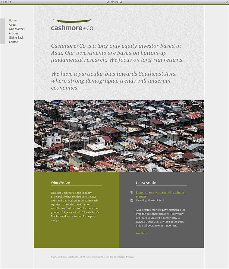
Cashmore+Co website

Recently, Neuro-Designs was commissioned to design the identity and website for Cashmore+Co, a new investment company based in the Southeast Asia. The details of the project can be found here.

To find out more about Cashmore+Co, visit their website at www.cashmorecapital.com.


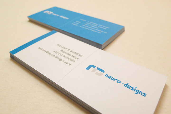
A few weeks back, we finished the design and printed our new business cards. It’s nothing much, really, except the fact that our old ones are 7 years old. I guess what they said was right, it’s easier to do designs for clients than to redesign yourself (which is also why our new website took quite a bit of time to design).

So, what has changed? Not much, but it’s a substantial move to reduce the clutter of our old cards. Here’s the old one:

Neuro-Designs Old Business Cards

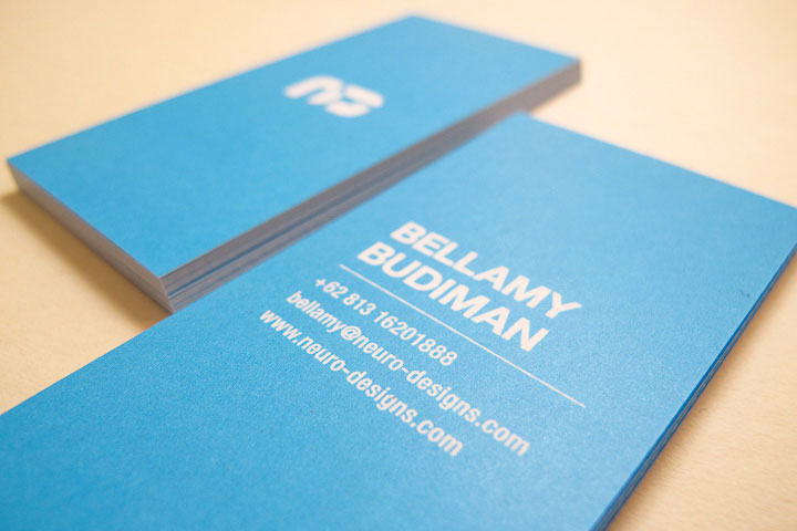
And here’s the new one:

Neuro-Designs New Business Cards

We reduced everything down. The office’s physical address, telephone, email, and even down to our logo. Because we wanted people to actually browse our website, what you see there is just the essential contact information of each person.

Besides, nobody wants to read an insanely-packed information in a tiny business card.


10%

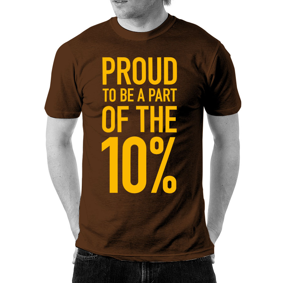
Tired with the local news lately? Tired that there’s nothing but impossibly and unbelievably hopeless news? Well, rest assured, because we are tired too. But no matter, as long as we can uphold the fact that we are part of the better people. So here’s the T-shirt to remind that to ourselves constantly. Why 10%? Because we believe that the number of sensible people in the country we’re living in is no more than 10% of the population*.

Update:
Pre-orders have been closed. You can now purchase this T-shirt in our store.

*This is not based on any actual statistics or scientific studies. This number is purely an opinion.


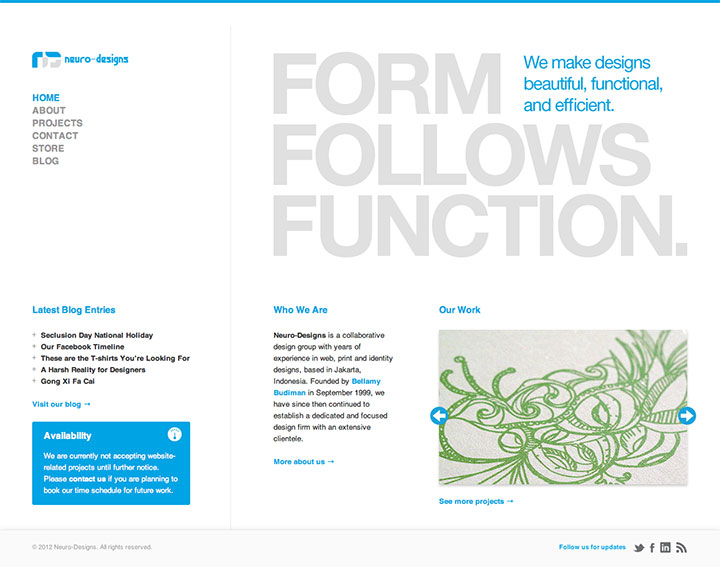
Neuro-Designs New Website

After long hours of tests and codings in multiple devices, we’re finally releasing our latest redesign to our own website. Considering that the last time we did this was back in 2008, so yes, it’s been a while.

So what are the new features about this site? Well, there are a couple of huge things that we did. First of all, we are now basing the design on the 1280×1024 resolution, so that gives us a bit more room to showcase our work.

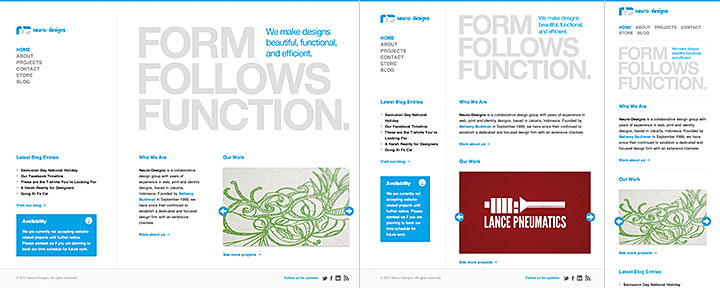
Neuro-Designs Responsive Website

Second, yes, it’s finally a responsive website! Go ahead, you can try resizing your browser window and see the website resize in real time, and you can open the website on most, if not all, modern mobile devices.

We know that as probably with all things digital, improvements are bound to happen. For example, probably not all of the graphics in our website are mobile-optimized, and they won’t be supporting the new iPad’s crisp Retina Display until we can get a hold of the device ourselves. Releasing out a new website doesn’t mean that we can push out new features without getting worried that bugs don’t exist.

So what’s next for us in terms of designing websites? Now we can use our website as a test bed for our clients should they decide to create responsive versions of their websites, and hopefully, we can phase out our aging mobile website. We won’t be needing it anymore with our main website now being responsive.