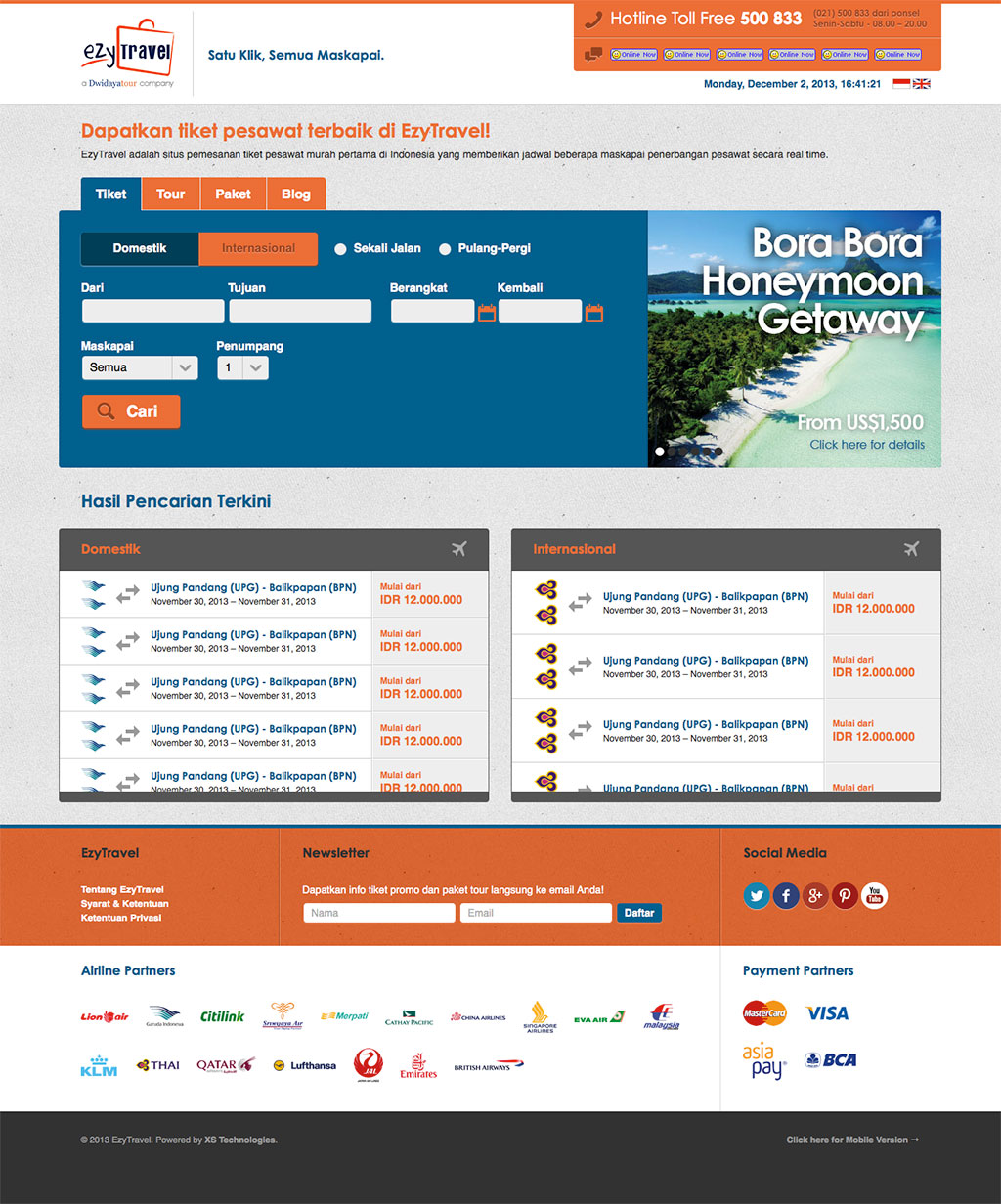
Earlier this year, we were commissioned by EzyTravel to rejuvenate their web presence into something cleaner, more modern, and most importantly, easier to use. Our work starts off with simple wireframes, cutting away unnecessary steps and contents, to further streamline the most essential functions of the website. Above is the screenshot of our proposed design, which was then passed on to their development team for implementation.

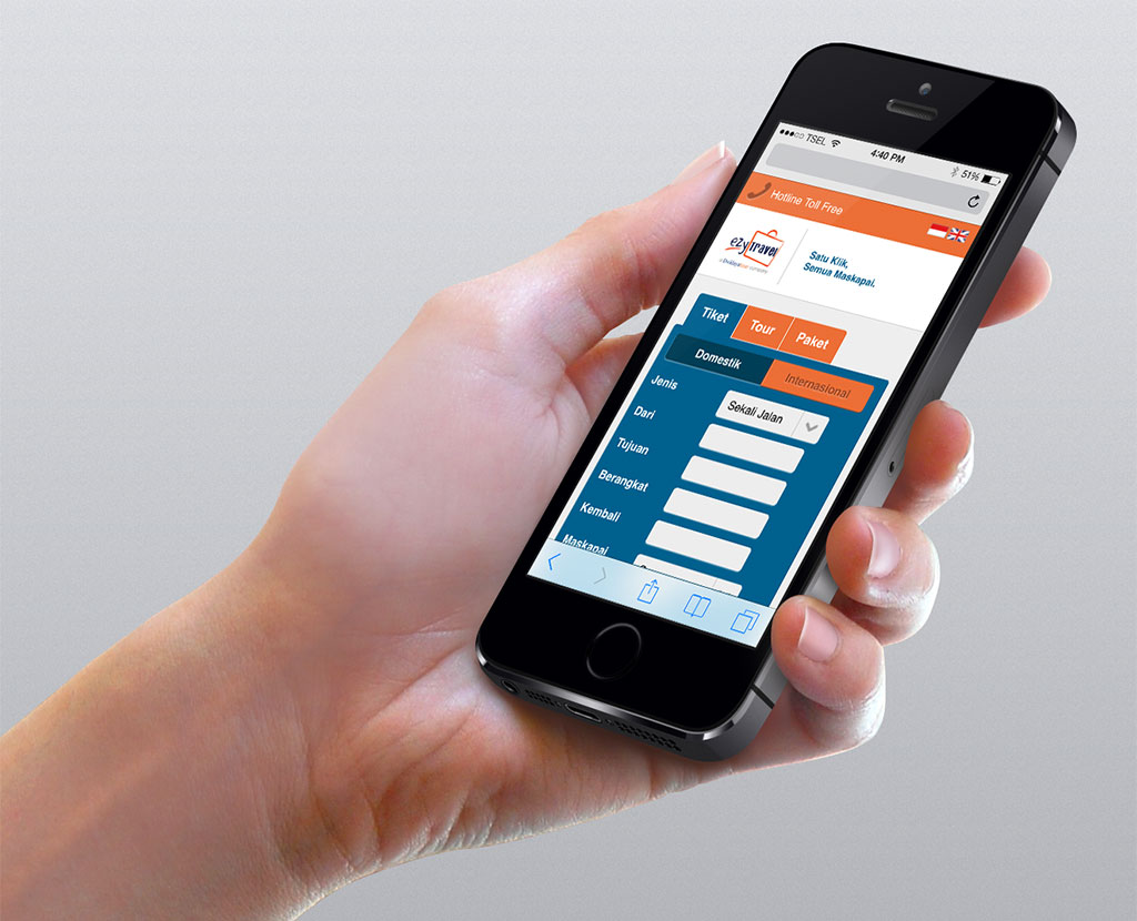
We also helped them realize an updated design for their website’s mobile version. One of the biggest hurdles in the design is that it has to stay similar across multiple mobile devices, while keeping all the required functions intact and making sure that the user experience, while adapted for mobile use, stays as similar as possible with the desktop version.
Disclaimer:
Our scope of work only covered the design stage. Actual implementations are subject to modifications and may result in a slightly different direction from the designs above.
