For more than 10 years, our small studio has been its current state. Since its construction back then, it looks pretty much the same except for furniture upgrades and unplanned improvements. We needed something new. And with great joy that we finally finished the renovation just before we hit the new year in December.
Before we started the renovation, we’re quite settled that we wanted something that looks less sterile. Something that looks modern, comfortable, but doesn’t have all the white glaring at us while we’re working. So we turned this (photo was taken at 2007):
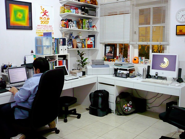
into this:
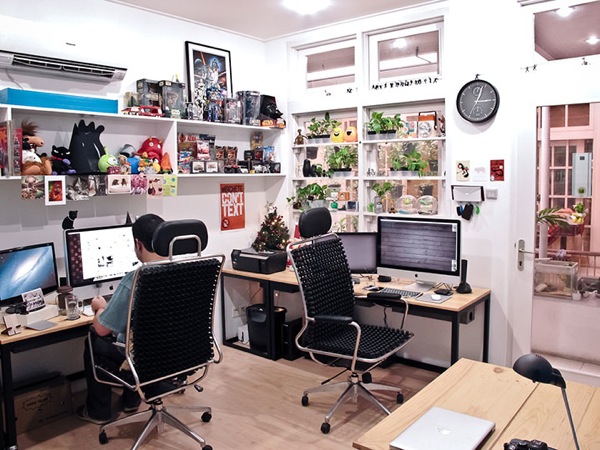
With last year’s renovation, we wasted no time at all planning all the new furnitures and made sure that there is no space left without function (except white space, of course. And pardon the pun). Let me bring down the details to the things we did with the new office.
First of all, we hated the old floor. Yes, it came with the house the studio is attached to, but for improvement’s sakes, we opted for laminated flooring. We also installed three new ceiling lights improve the office’s lighting, as well as a full glass door to bring in even more light during the day. This gives our office at least 50% of lighting improvement.
We also custom-made our own workstation furnitures. What you see in the photo above is the result of Nyonyo pulling out his superb engineering and product design skills. Our new workstations were built from scratch from welded steel and reclaimed wood, and it comes installed with a custom-made cable box for neat cable organization. The workstations are now paired with Accupunto director chairs.
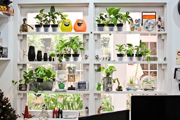
Zooming to the west wall–which is also our office facade–we scrapped off the vertical blinds for something more functional. Other than the reason that we’re too cheap to buy new window treatments (no, just kidding), the new shelvings practically act as plant holders. And in bright and sunshiny days, it also functions as a passive sunshade.
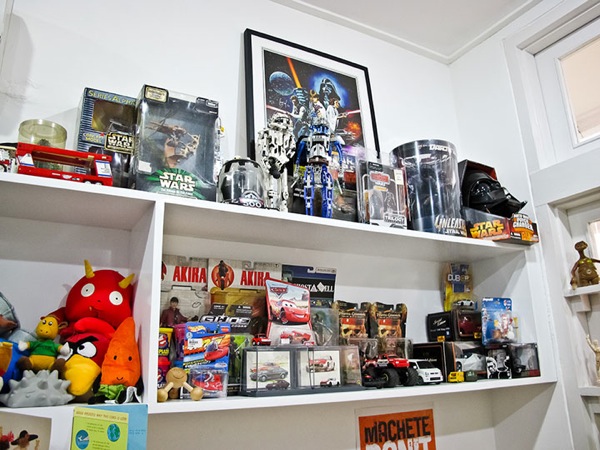
Moving on the the south wall, we installed a dedicated display shelf for the toy collection in our office. The shelf also holds poster frames and a variety of things that we prefer not to hang on the wall.
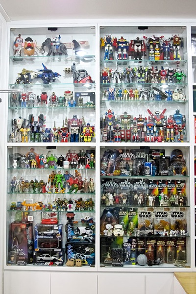
The north wall features a full-height display case to hold yet more toys (trust me, toys are good). It is organized into 4 sections. From top right clockwise, they are the Godaikin section, the Star Wars section, the 80’s and 90’s toys section, and the Transformers section. Next to it is a dedicated bookcase that you can partially see on the next two photos.
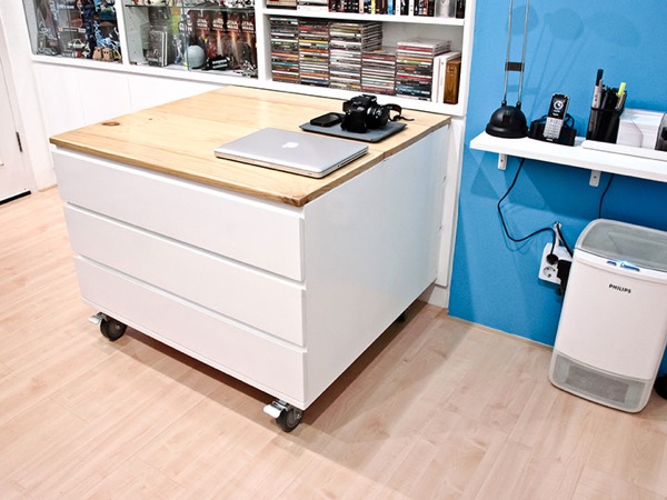
We also built a movable utility table stored by the cabinets at the north wall. This table houses a variety of office supplies and stationeries. A pretty handy thing to keep the office neat.
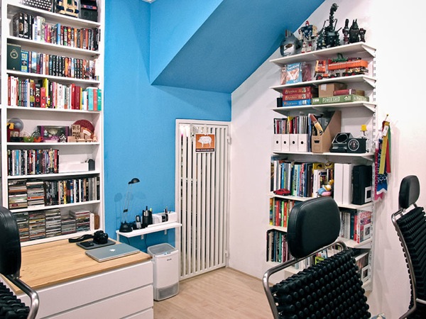
Moving slightly to the right, we painted one corner of the office with our signature blue color, added another book shelf to the east wall, recycled from the old ones we pulled off the old office, and we replaced the storage room–which we call “Le Dungeon”–door with a new one.
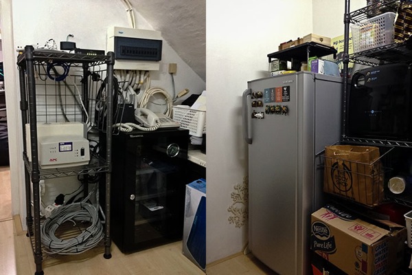
“Le Dungeon” is a small storage unit adjacent to the main studio. It houses our networking equipment that manages the network throughout the house, as well as a small pantry to keep us alive for some time should there be a zombie apocalypse.
So there we go, a quick tour of what our office has become after more than a decade standing there. Not to shabby for 3-weeks worth of planning.
Disclaimer: No, we don’t store little children for snacks in the “Le Dungeon”. If you hear otherwise, that is just simply absurd.
